This project was from my Projects in Graphic Design class where the point was to take an established publication and rebrand it. I chose to rebrand Trains Magazine as I think needed a visual overhaul. Alongside that, I also need to create deliverables with the publication so I chose posters and a spread from one of the articles in the rebranded magazine. I used Indesign to create the covers and Photoshop for mockups.
Flat Covers
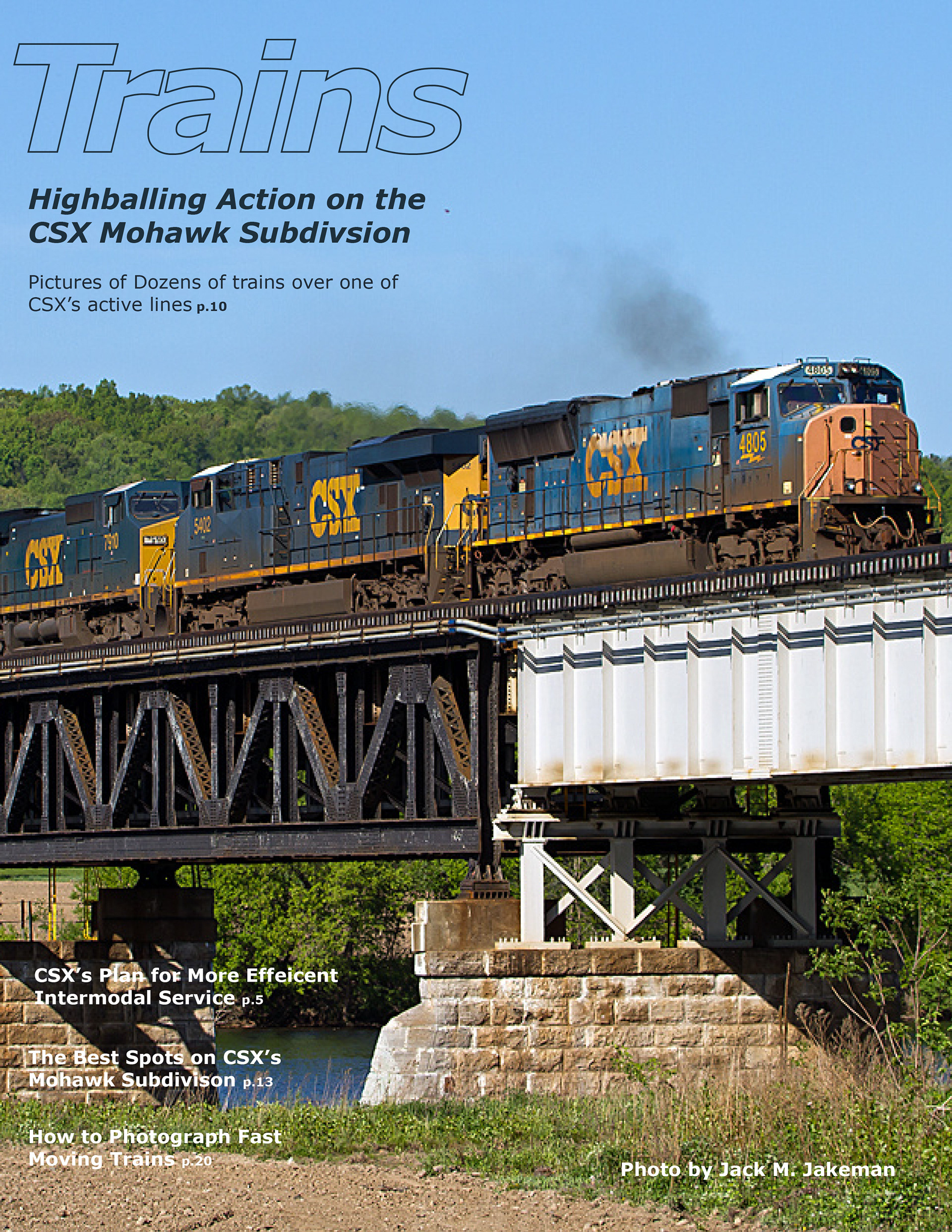
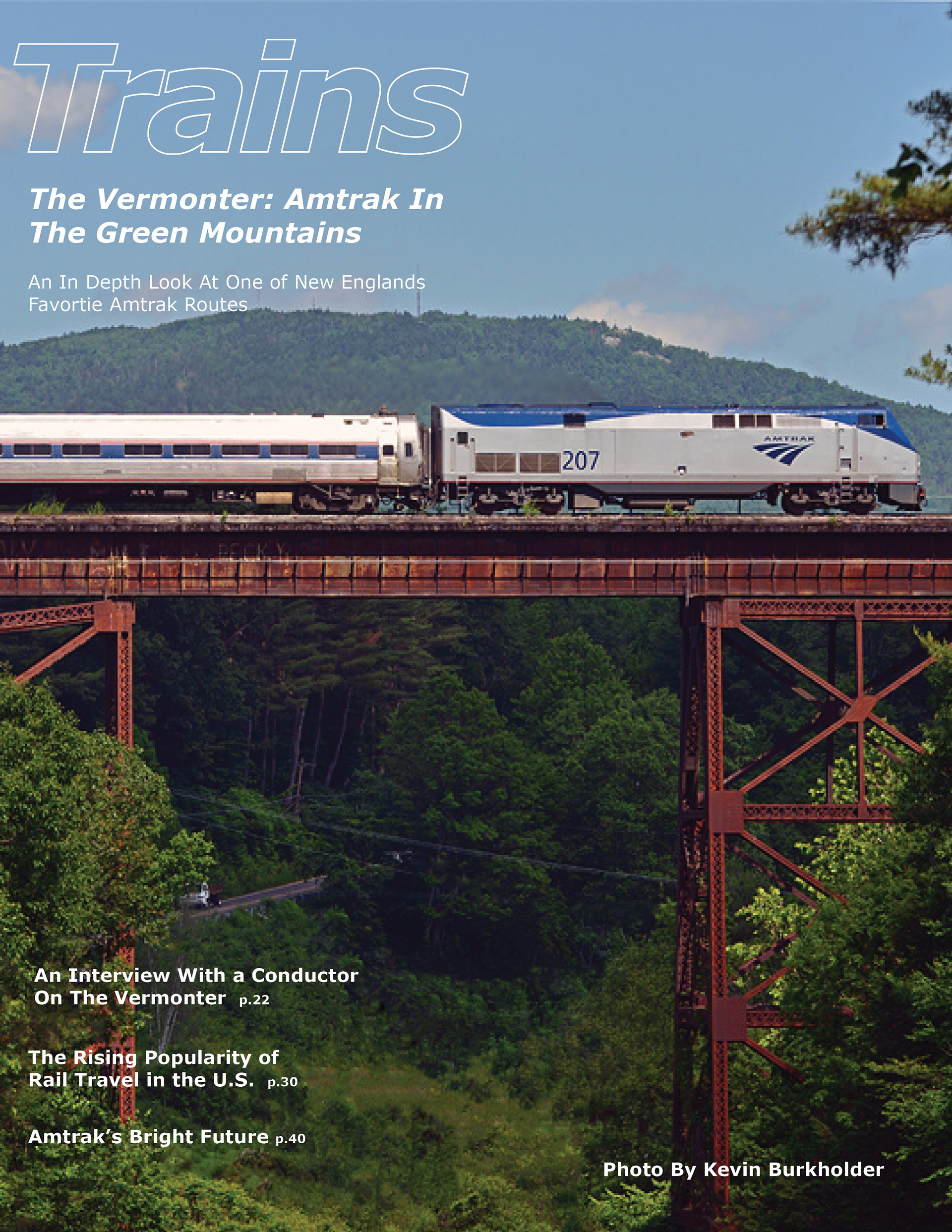
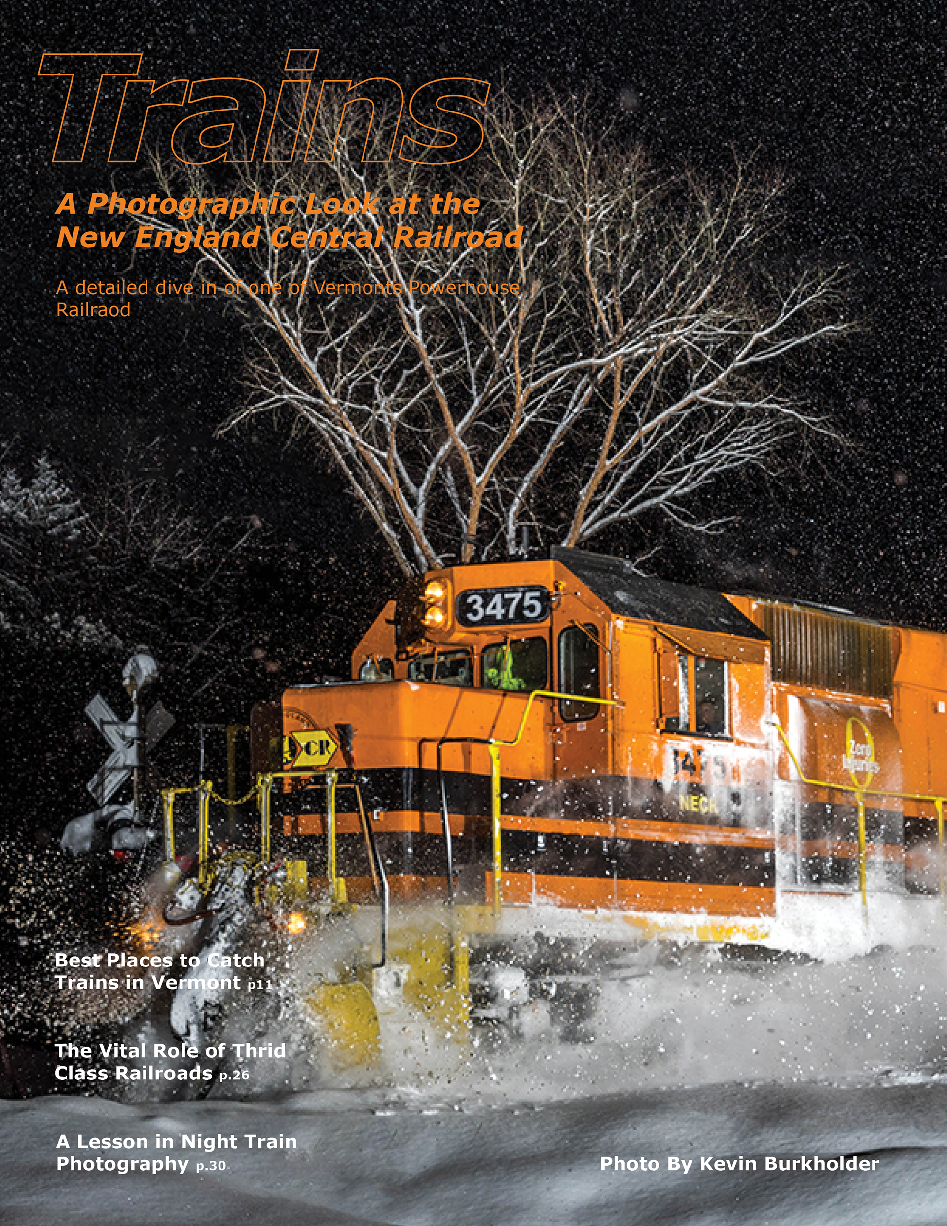
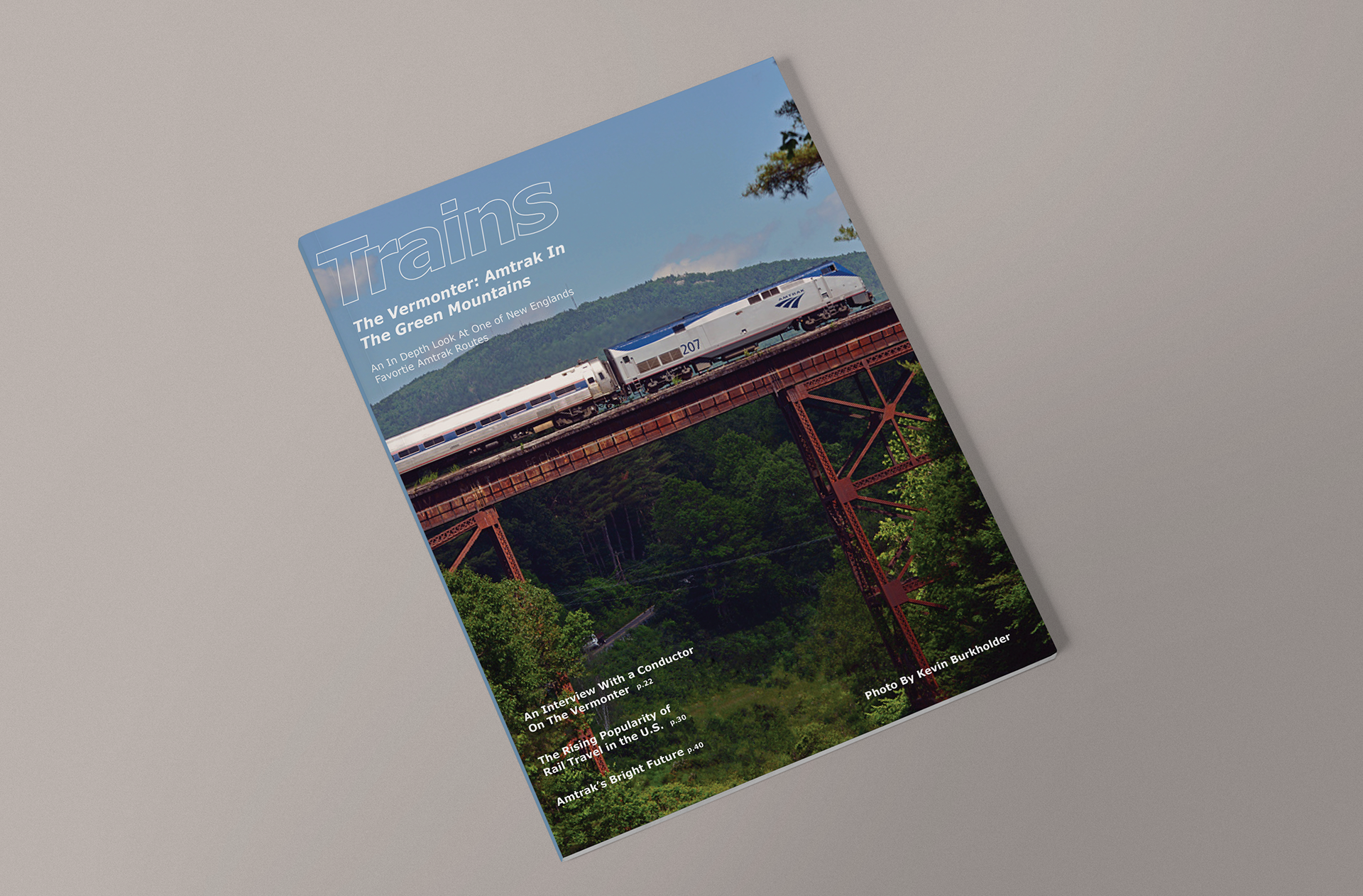
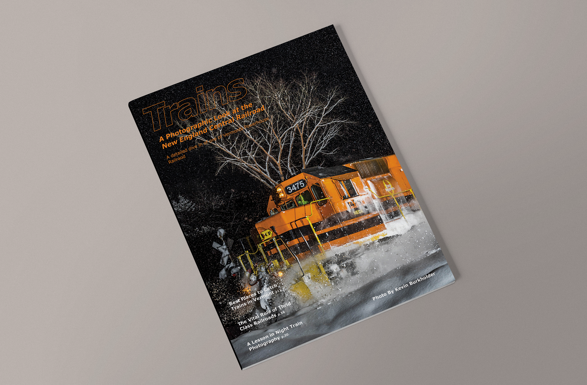
The original Trains magazine covers are cluttered and hard to read with type covering every inch of the page. My solution was to strip back all the information and let the photography tell the story. I also made the logotype clear so the cover could breathe more and only included the feature stories on the cover. The colors of the type would come from photography featured on each cover.
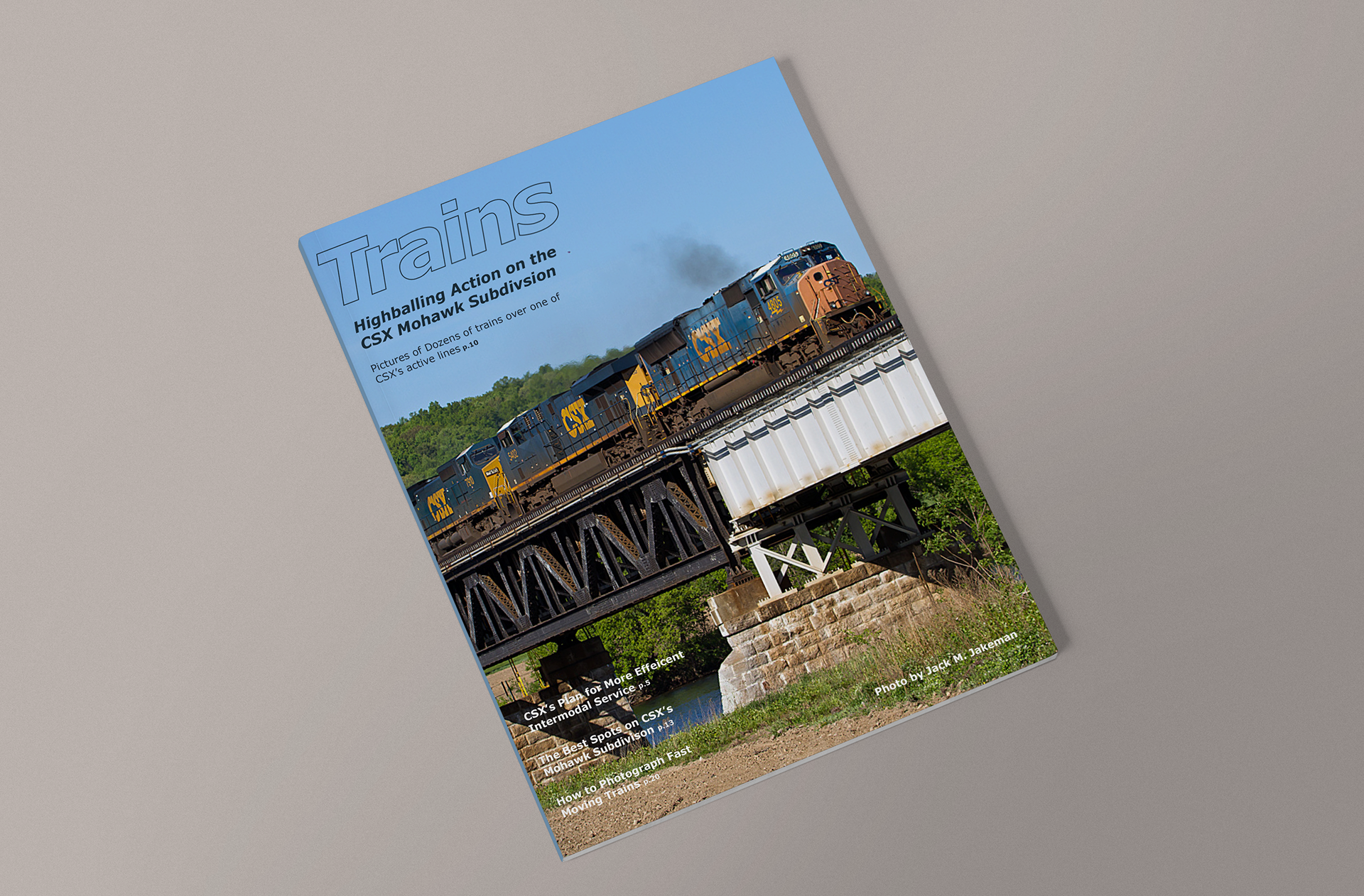
Mockups of Covers
Posters
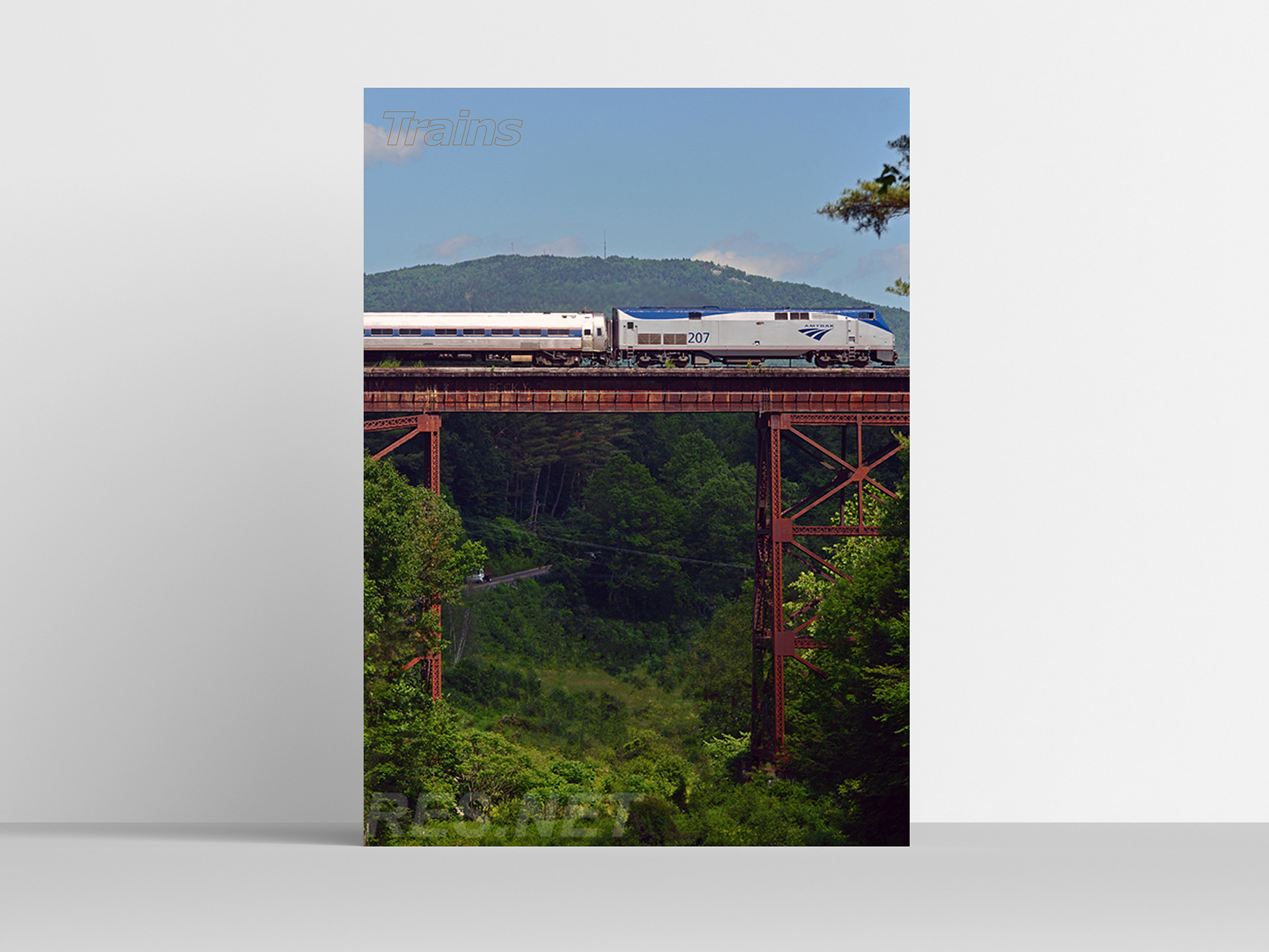
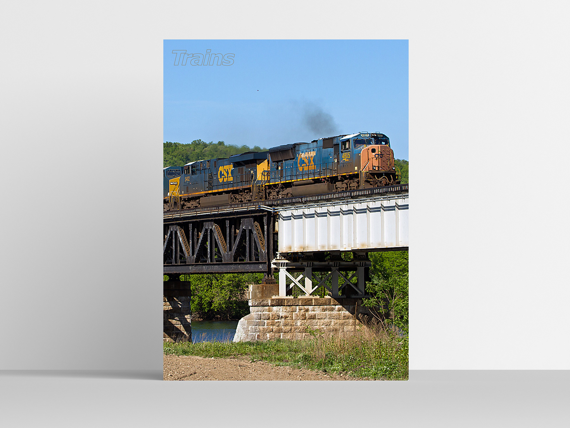
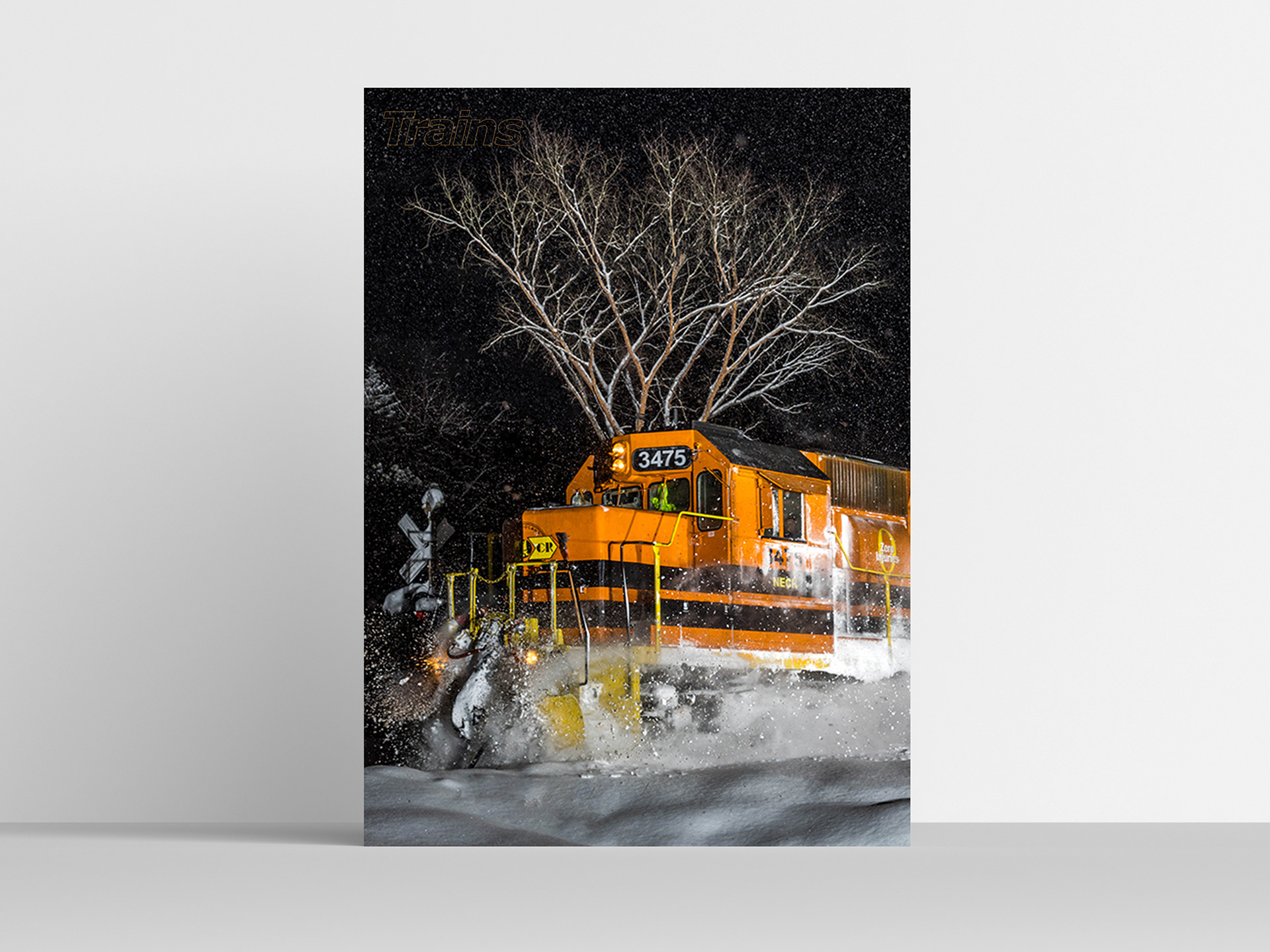
The posters would be blown-up versions of the covers from each issue. Each poster would be monthly and come out with the corresponding issue. I wanted the photography to take the spotlight on these posters and therefore only included the logo on the poster.
Magazine Spread
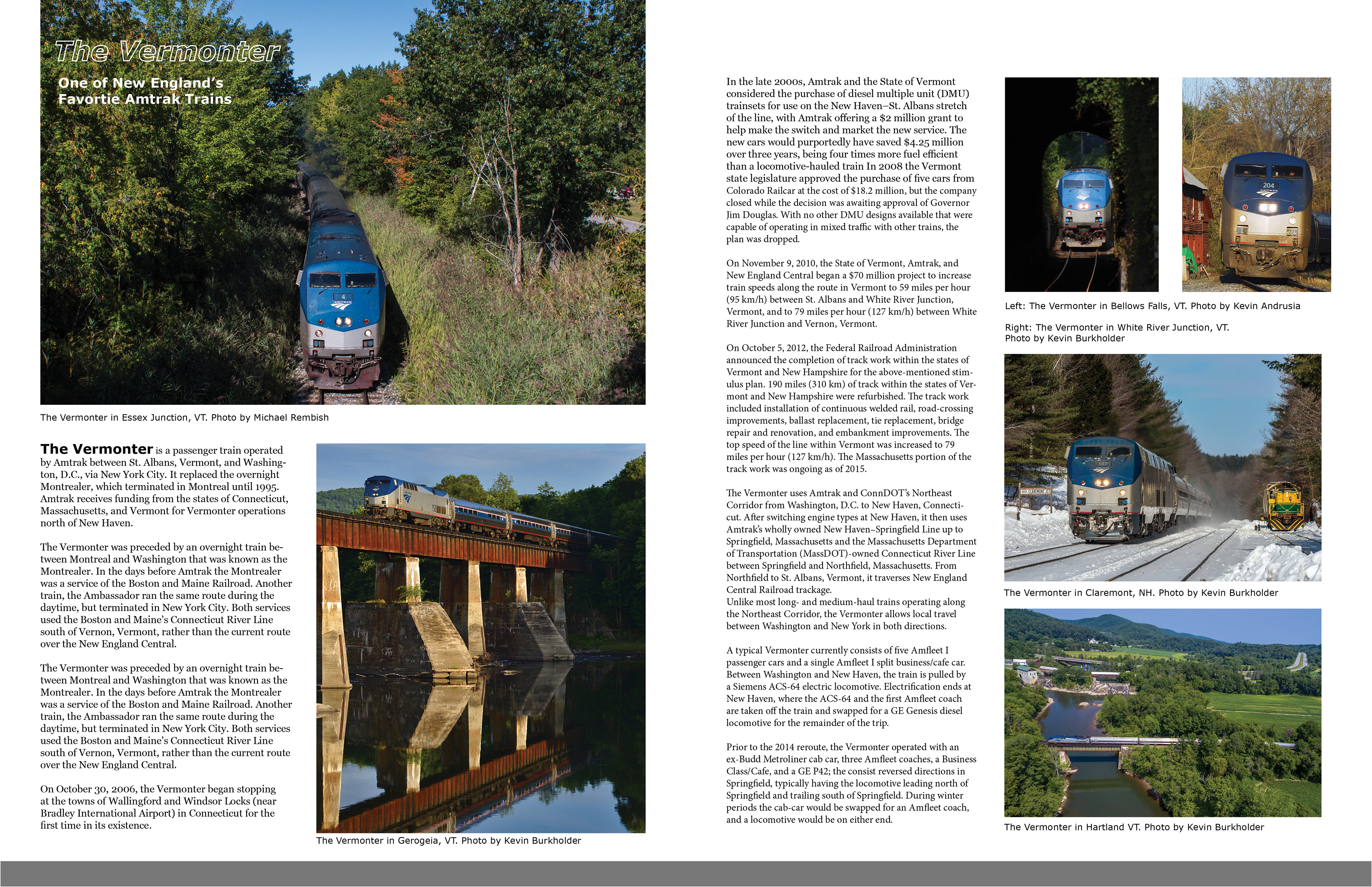
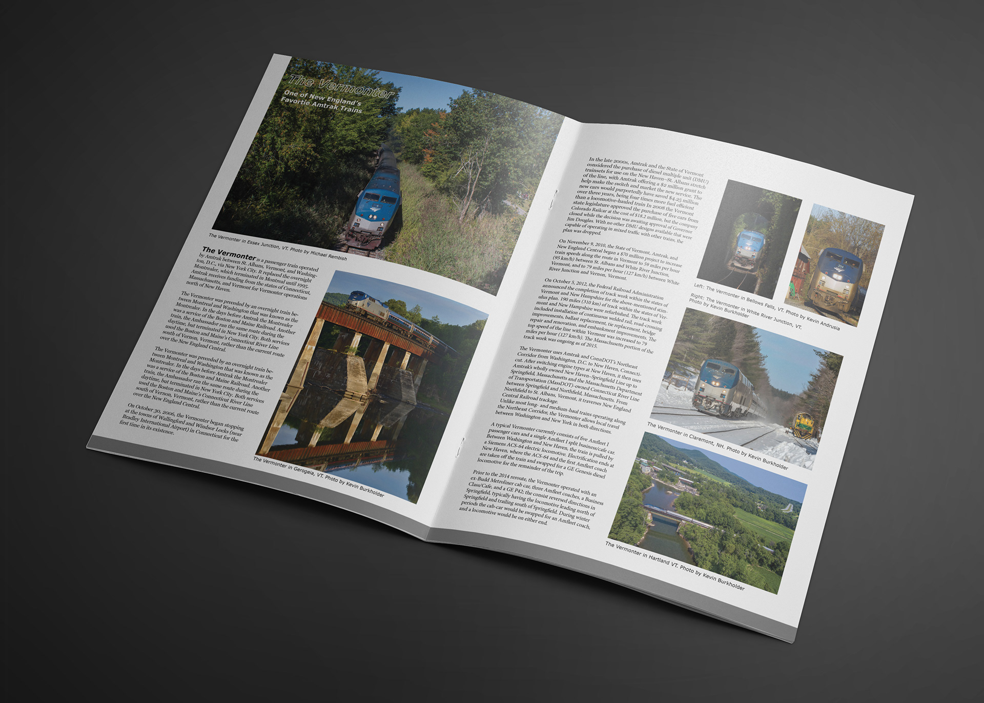
I created a spread for an article that would be in the issue about Amtrak's Vermonter. I decided to use a serif font for the body copy so it could contrast well with the headers. I wanted to include a lot of photography of the subject of the article so the article is more engaging. I made sure that there was room for each photo to be credited to each artist. This format is more engaging because you have visuals to help engage the reader. (Text used in the spread was from Wikipedia.)