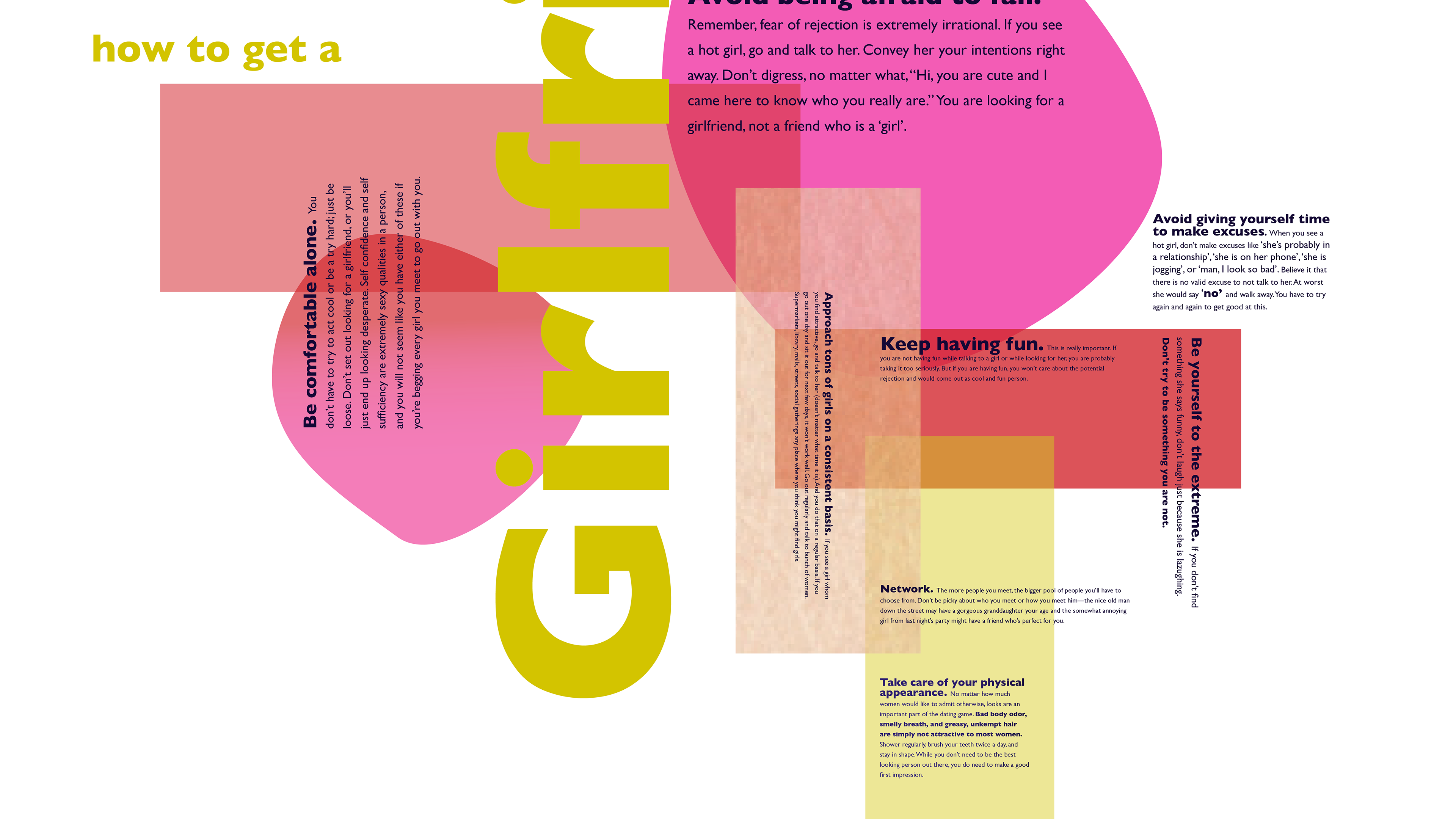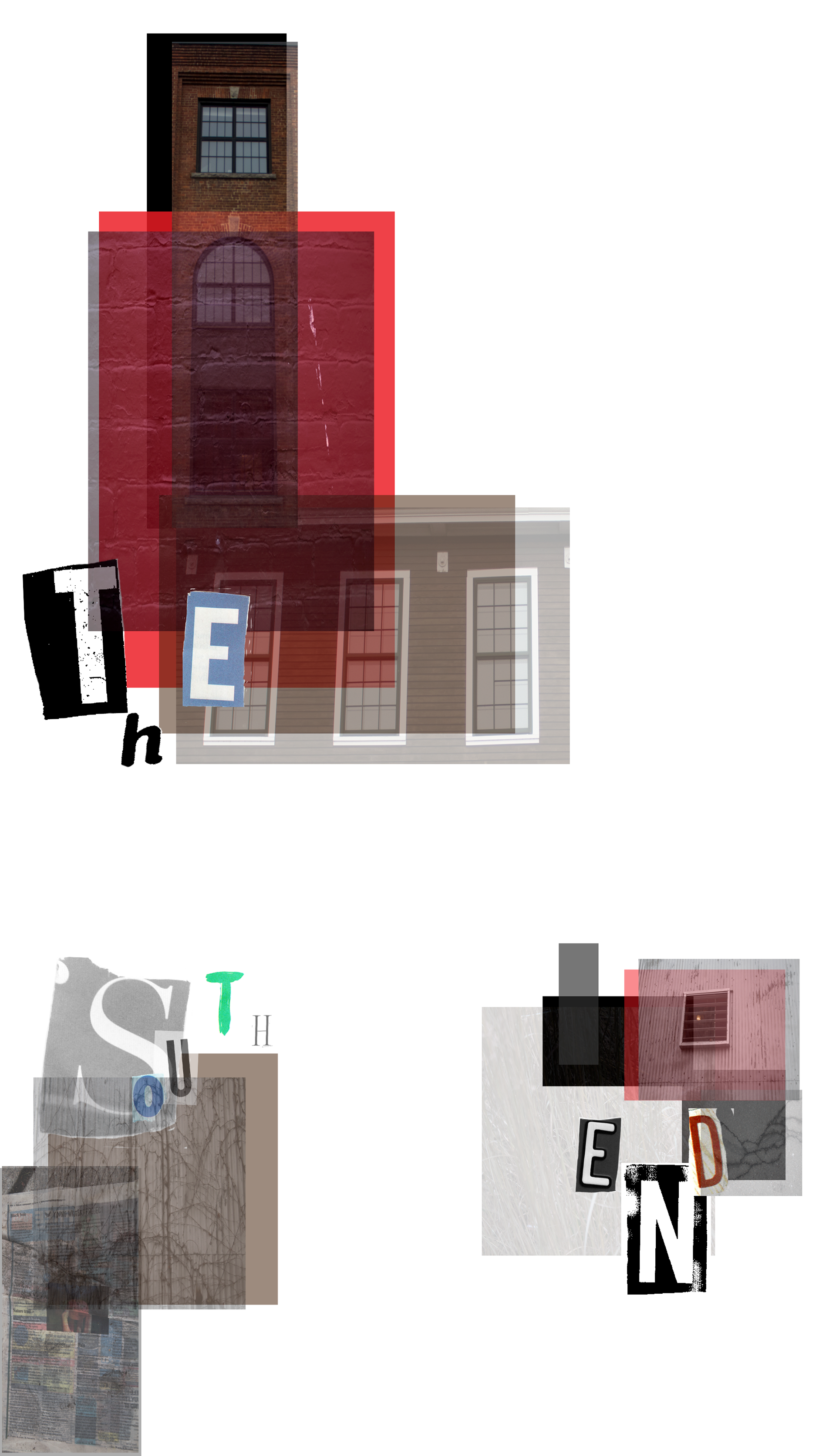
I used cropped photography of buildings and textures from the South End, cut typography from magazines, and colored squares to make my poster feel like the words I chose. I took various pictures of the building down at the South End that fit the words Brick and Old. Then I used cut-out typography which made the poster feel more industrial. Finally, I made three rigid structures to make the piece linear and let the white space congest the rest of the poster.